FINE TEXTURES AND PHOTOGRAPHIC OVERLAYS TO ENHANCE YOUR PHOTOGRAPHY AND MORE


Tuesday, September 29, 2009

Honesty (texture tutorial and recipe)

In this quick and easy tutorial, I'll illustrate how I transformed this photo of honesty in a bottle into something more painterly and rich. Mouseover the photo to see the before and after effects.


The first texture I tried was Pompeii stucco, an easy-to-use texture that adds depth.

I opened the texture in photoshop and dragged it on top of my photo, don't worry if your texture is a different size or shape from your image, just resize to fit.
Once your texture is covering your image, have a play with the blending modes and opacities. Here it is at Soft Light 47%


I rarely use just one texture on an image so I tried some more and ended up using a layer of Necropolis at Overlay -40%  and a layer of Elysium at Colour burn -14%
 

Just a quick curves adjustment layer to tweak the tone and contrast a little. Click "Create new fill or adjustment layer" button at the bottom of your layers pallet  and selecting curves from the drop down list.


And we're done!


Monday, September 28, 2009

Dragonfly on the sand dunes


To enliven this dragonfly in front of an 'out of focus' sand dune,
I simply added several layers of flypaper's 'Nora batty'
At various mixes.

Sunday, September 27, 2009

Golden Daisies (with texture recipe)


I "played" with this photo for hours before coming up with this and thought you might like to know my "recipe". Though of course you'll have to treat the instructions as a guide as no two photos react in the same way when treated with texture.

First I duplicated my background and did a little tidy up with the clone tool.
Then I added a black and white adjustment layer and reduced its opacity to 30%, this desaturated the image slightly.
I then started trying out different textures and finally settled on a layer of Flypaper Bruised Saffron at Color 22%
Then another layer of Bruised saffron this time at Multiply 11 %
Next was a layer of Apple Blush at Overlay 40 % followed by two layers of Pompeill Stucco, the first at Soft Light 72% and the second at Hard Light 40%
If any of the textures are dominating too much, you can blur them slightly by using a Gaussian blur of around 2-4 which is what I did
Enjoy :-)

Saturday, September 26, 2009

Mist in the trees tutorial


For this misty mountain top landscape,
I used just two flypaper textures,
Raw Linen @ Linear burn setting 46% and opacity at 63%
although I liked it, I didn't need the texture, so I blurred it with Gaussian blur for a smooth finish.
Necropolis was used in Overlay @ 55%, Opacity 56%
So we come to the 2nd brown version.


I really wanted a fresher look so I went to the top of the page,
image - adjustments - colour balance, with Necropolis-only selected,
and moved the sliders as shown, the Necropolis texture becomes bright green!


Flatten and crop square.
Et voila, a nice fresh but misty/moody landscape!

Thursday, September 24, 2009

Basic Texture Tutorial

In this first tutorial of what we hope will be a continuing series, I'll show you how to easily transform a photo by adding our Flypaper Textures. Mouseover to see the transformation.


The original photo is nice enough, but I thought texture would add more depth and interest.
First thing to do is duplicate your background.
 I opened my Flypaper Texture folder and decided that pompeii stucco might be the best one to try first. Choosing which texture goes with each photo is something you learn with practice and experience as texturing is not a "one size fit's all" kind of thing.


Open the texture in photoshop (or your editing programme) then with the move tool selected  drag it from the layers palette on top of your image. It doesn't matter if the texture is a different size or shape from your photo, you just resize  to fit by using the drag handles on the corners.

Once your texture is covering your image, have a play with the blending modes and opacities.
Here is my texture at  Soft light blending mode and 100% opacity


It looks okay but lacks depth, so I had a play with several different textures, you'll find when you're using texture that your delete button will be your best friend as you try out combinations.
Anyway, I finally hit upon using our Bruised Saffron texture at multiply and 37%

Then another layer of Pompeii Stucco at soft light 37%


Almost done, but the colours need a bit of a tweak. So I added an curves adjustment layer by clicking on "Create new fill or adjustment layer" button at the bottom of your layers pallete and selecting curves from the drop down list.
Once the dialogue box opens I played with red, green and blue curves  until I got the tone I wanted. A little goes a long way with curves so it pays to be gentle.


And voila! We're done!
And just so you can see a bit better the effect that the texture has had, here's a close-up showing some of the detail.


Of course with different texture choices and opacities it would be quite a different photo, so just treat this is a guide.
Any questions or suggestions for future tutorials, drop us a line, or leave a comment.

Wednesday, September 23, 2009

Circles of your mind


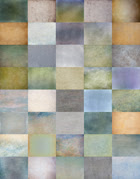
Here I used five of our 'flypaper 1' textures.
I find that using several textures at a gentle opacity,
really helps build up interesting depth and atmosphere!
Pomeii Stucco
Bruised Saffron
Raw Linen
White Shagreen
Elysium

Monday, September 21, 2009

Softly softly....


I took this yesterday when we visited our hut in the country to the south of Dunedin, everything was wonderfully spring-like with the soft greens of the willows, daffodils amongst the grass, little lambs over the fence and the flowering cherry in full glorious bloom.
To show that our textures can be used subtly to brighten and soften, I processed this relatively lightly using our Uranium Paper and a touch of Pompeii Stucco.

See it on Flickr

Friday, September 18, 2009

The Letter


Here I used our 'Necropolis' texture very lightly.
By simply running your mouse over the image you'll see before and after the textures were applied!

Thursday, September 17, 2009

Golden Gingko


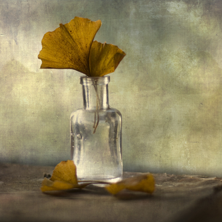
Gingko leaves in an old bottle with an added touch of our wonderful "Tarte Tatin" texture to give depth and a painterly look.

Logistics


Nora Batty (inspired by the BBC's 'Last of the summers wine') was used here to illustrate Logistics or Summers End, when our local beach shack cafe was removed :-(

Wednesday, September 16, 2009

Sentinel


This photo was taken on the way to Central Otago here in NZ on a freezing winters day. As you can see from the original (mouseover to see) it was an almost monochrome landscape. I used our Tarte Tatin and Antique Liaisons textures to add depth and then toned blue to reflect the cold feel.

Tuesday, September 15, 2009

The Big Eat


Again, I think its a simple use of our 'Nora Batty' texture overlay.

Monday, September 14, 2009

Painting the sky


A simple daisy against the sky is enhanced using our Apple Blush texture -it was so quick and easy to do!

Sunday, September 13, 2009

Beach Builders


This texture is a favorite, I've only used it once here,
but we're planning on bringing more out asap!
It was named 'Dangerous Liaisons' as it brings to mind a crumpled letter.

See it on Flickr

Saturday, September 12, 2009

Illumnating


This golden scene features a texture that will be in an upcoming pack, so feel free to check back. We were walking on a beach on an overcast evening when suddenly the sun burst through a hole in the clouds!

Friday, September 11, 2009

White Barn


Our 'Leaky Garret' texture was used here.
If you look closely, you'll see the graffiti I removed from the barn!

See it on Flickr

Thursday, September 10, 2009

Plantain


Used my old favourite Necropolis in this one! This is the seedhead of the weed Plantain, a common plant in pastures and lawns but in my eyes at least very photogenic.

Wednesday, September 9, 2009

Drama in the Sky


Local clouds often stream down from the distant black mountains,
sometimes they can form into violent thunderstorms,
but mostly die back by the end of the day.

The texture was 'Necropolis' but used with a very weak setting.

Tuesday, September 8, 2009

Dog Day Afternoon


A golden dog on a golden beach, enhanced by our wonderful "Nora Batty" texture :-)


See it on Flickr