Monday, November 30, 2009
Five
Another shot taken on a walk on the lovely Doctors Point Beach just to the north of Dunedin. These same people appear in a similar shot but I processed this one quite differently which shows how a different textures can give the same scene a whole new look. As well as some Flypaper Textures, I used a new one that will be available in a soon to be released pack once we've made up our minds what to include :-)
To start with I duplicated the the base layer, I then blurred that layer using the lens blur and added a layer mask and removed the blur from my subject, the people
The textures I used were
Tarte Tatin @Soft light 45%
Shargreen Bone @Overlay 45% This layer had a mask added to remove the texture from the ground area.
Bruised Saffron @ Overlay 13%
Lamp White Brush @ Soft light 25 % with the texture removed from the ground as before.
Unnamed new Flypaper (available soon!) @ Overlay 77%
Sunday, November 29, 2009
Bust and tree
On the same day but taken just before the last 'Reflected Light' posting. This is inside our Beziers Park of the poets, decorated with many stone carved busts. Its made up of two pictures, merged in photoshop, as my Autopanopro was playing up!
A more finished/textured version of this image is on my Flickr site.
As always the textures are from the first used.
Apple Blush - Opacity - Soft Light 43%
Necropolis - Opacity - Soft Light 72%
Caramel soft - Opacity - Hue 54%
Raw Linen - Opacity - overlay 21%
Raw Linen - Opacity - overlay 21%
Friday, November 27, 2009
reflected light
Walking back from our local 'Park of the Poets' in Central Beziers,
I came across this dark and narrow bow terrace.
The lowering sun reflecting off the opposite houses stucco in an interesting way, lighting the upper apartment windows.
You'll see I've removed a mass of visual pollution from the skyline, aerials are the one thing I almost always clone out!
Processing was easy, I just used several textures to build up a good depth of grunge.
Caramel Cream - Overlay - Opacity @ 84%
Dangerous Liaisons - Overlay - Opacity @ 27%
Orient Express - Multiply - Opacity @ 35%
Raw Linen - Soft Light - Opacity @ 100%
Pompeii Stucco - Overlay - Opacity @ 18%
See it on Flickr
Labels:
"Flypaper Textures' TEX Pack 1,
France,
med,
reflected light,
stucco,
terrace
Faded Memories
These half dead flowers are the remainder from an earlier photo session but they caught my eye when I was trying out my new 50mm lens. Focusing at f1.4 is very hit and miss I can see even with auto focus :-)
Processed with Flypaper Textures Tarte Tatin @ Soft light 36%
and Pompeii Stucco @ screen 33% (softened slightly with a guassian blur) A layer mask was used to remove some of the texture from the flowers.
Finally I used a curves layer for a final adjustment to the tone.
Have a great weekend everyone! I'm looking forward to some time for some more experimenting with my new toy:-)
See it on Flickr
Sunday, November 22, 2009
Flypaper Textures: Cow on the Hill
We visited our "hut" in the country during the weekend, it's situated beside a river in the midst of farmland so we had sheep over one fence, someone making hay in the paddock over the river and over the road there was a large herd of dairy cows.
I processed this lady with Flypaper Textures once again..
First was a layer of Dangerous Liaisons @Soft light 65% this brightened the image a little.
I followed with a layer of Nora Batty @ Overlay 100% this layer was blurred to soften the texture a little
Then I added a layer of my favourite Apple Blush @ Multiply 73%
Finally I tweaked the tone using a curve layer and added a slight vignette using the lighting effects filter (see my previous post for details on how to do this).
And the result...a more painterly cow :-)
Thursday, November 19, 2009
The Happy Couple - Flypaper Textured :-)
About a month ago I visited a local beach with my son, intending to take photos of him but when we looked over the sand dunes we were surprised to see this pair of NZ Sea Lions a short distance away. Naturally I rushed back to the car to exchange my short lens for a longer version as these guys don't like you getting too close, they are surprisingly fast movers too and you had to keep an eye on them especially if you got between them and the sea.
This is but one of the many photos I took that afternoon and was processed with Flypaper Textures to add a bit of depth and a vignette
The Flypaper Texture I used was Caramel Soft, as well as adding texture it gives a slight vignette effect. I used it at Soft Light 100% This layer was blurred an desaturated.
As well as the texture I used a vintage film effect (a combination of curves, colour layers etc) to mute the colours.
Once I was happy with the effect I used the stamp visible command on a PC it's Ctrl -Alt -Shift -E duplicated that layer and changed it to a Smart object from the drop down filter menu, this wonderful feature which was introduced in PS CS3 lets you go back and edit your filter settings.
Then I used Render lighting from the Filter menu to add more of a vignette. From the render lighting dialogue I selected a 2'oclock spotlight and omni and then tweaked the settings, this can take a while as there are lots of controls to play with, as well as intensity you can also change the colour of the light and the size etc.
See the following screenshot for more details.
I reduced the opacitiy of the lighting layer to about 50% After a final curves layer to adjust the contrast I called it done!
Wednesday, November 18, 2009
red box
Back in early July we made a special trip to the beach at sunset just to photograph the full moon rising over the Mediterranean.
The light was superbly opalescent, and I was lucky, as I captured several nice images as well as the later moonrise.
This is one, a huge red container, not sure why it was there or what it contained, but being this amazing rust,
the final rays of the sun turned it into a stunning bright red.
The base image has already been brightened, I only needed a texture to beef up the tones and give a slight vignette effect.
I chose just one, Caramel Cream - soft light Opacity - @ 45%
This was given the full 'Gaussian blur' treatment for a really smooth finish.
I gave the final image a clean up with a slight paint effect, and removed a group of people on the left with the clone tool.
If you look on my Redbubble thread, you'll see another more painterly version.
Monday, November 16, 2009
Night Surf
Sometimes the most interesting shots happen as accidents.
I was playing with moving my camera during a longish exposure at the end of a beach walk and this was one of the resulting photos.
My processing was simple, I used a blue toned (with a hue saturation adjustment) and slightly blurred Caramel Soft @ Overlay 100%
A final tweak of tone and contrast and voila it was done!
Sunday, November 15, 2009
derelict farmhouse
Whilst on the way to the beach yesterday,
with a slight sea mist over the vineyards.
I came across this derelict farmhouse in a sea of golden vines.
'Chasse Gardee' I'm told, means strictly licensed hunters only.
Apple Blush - Soft Light Opacity @ 29%
Raw Linen - Overlay Opacity @ 100%
Necropolis - Overlay Opacity @ 39%
Caramel Soft - Soft Light Opacity @ 27%
Both the final Necropolis and Caramel Soft textures were brushed off the left side of the image to help balance the tones.
The hard canvas texture of Raw Linen was left to help pull it all together.
Labels:
derelict farmhouse,
Flypaper Textures,
France,
Paul Grand,
Vines
Saturday, November 14, 2009
Leave only Footprints...
Hot off the camera....Taken on a lovely walk on the beach this evening -there was some dramatic storm light and the sea looked amazing and even if my photos didn't do the scene justice, it was great just to be there.
This one looked okay before but I thought I'd see what I could do with some textures, it was processed using these Flypaper Textures.
Shargreen Bone @Soft light 31%
Grosgrain @Overlay 76%
Another layer of Grosgrain @Overlay 76% but this one was slightly desaturated and its hue was tweaked so it was slightly more yellow
Apple Blush @Overlay 47%
Dangerous Liaisons @ Soft Light 54%
I finished with a curves layer as usual to tweak the tone and contrast.
Thursday, November 12, 2009
Life goes on
Another human for our professional readers!
Taken on a professional Portrait shoot with French Artist, Martine Roch a couple of years ago.
This one was never used but I now like the little surreal looking figure with a bucket in the corner!
It was shot in that cold, sharp April light, the shadows being so dark,
it needed a little help, thus we used a reflector for fill-in light.
We were standing on the Sea's breakwater for the maximum light reflected off the sea.
It was so bright, Martine couldn't open her eyes!
Shot in tiff.
Textures shown from first used to last.
Necropolis - Soft Light @ 34%
Raw Linen - Hard Light @ 48%
(this texture brushed off all the model)
Caramel Soft - Hue @ 43%
(texture brushed off the models head only)
This last texture setting is the important one for the
lovely grayness, Its percentage is vital as too little and the color is too bright, too much and it becomes sepia!
We're talking Goldilocks!:-)
Bigger version on my Flickr site.
Labels:
artist,
Flypaper Textures,
french,
Getty image,
Martine Roch,
Paul Grand,
portrait,
reflector,
sun,
surreal,
surrealist
Feeding Out
This was taken on our way to inland Otago in the middle of winter, at the time, the area was in the midst of a spell of hoar fross and there was freezing fog and a thick covering of ice on most things. It was very cold as you might imagine but so beautiful especially in the places where the fog had lifted a little. These sheep had just been given hay.
Anyway, quite a bit of experimentation went into the processing of this one before I hit on something I liked.
First of all there was a layer of Apple Crumble which had been blurred by about 30 @ difference 41%. This was just for the sky so I removed the texture from the land bit using a layer mask. The difference blending mode made everything a strange blue colour so I used a hue saturation adjustment layer as a clipping mask on that layer (I'll write more about clipping masks in the future) and reduced the saturation.
Next was a layer of Apple Blush at Overlay 32% and once again I masked off the land so the texture was just applied to the sky.
Then a layer of Nora Batty which had been desaturated slightly at Soft light 100%, this was just for the land.
Lastly I added a curves layer to adjust the tone and contrast.
Wednesday, November 11, 2009
Flypaper Textures video tutorials
We were contacted by the lovely Kayla from Digiscrap101 a while back, she wanted to do a tutorial using our textures,
and of course we were happy to oblige. Here they are, hot off the press and it's very easy to follow.
Enjoy:-)
Photoshop CS3 Video
Photoshop Elements Video:
and of course we were happy to oblige. Here they are, hot off the press and it's very easy to follow.
Enjoy:-)
Photoshop CS3 Video
Photoshop Elements Video:
Tuesday, November 10, 2009
Three routes into mist
Another misty 'Canal du Midi' shot, just west of Beziers,
our famous local French Atlantic coast to the French Mediterranean sea connection. One of the main reasons for its being built was to avoid having to sail around Spain.
Because just over two hundred years ago those pesky Spanish Pirates were quite a problem!
This in turn brought wealth to the wine producers in this area,
further unimagined riches came with the railways, over a hundred years later.
But that's another story..
The beautiful mile upon mile of huge poplar trees were planted to give the pulling horses and barge drivers some shade and help stop the canal water from overheating and thus turning stagnant in our hot summers.
Hope you're taking notes as there will be a test later! :-)
First of all, try the Curves option to bring out more light.
This picture is made from 4 images joined together in 'Autopanopro'
As always, I list from the base texture up.
Apple blush - Opacity - soft light @ 18%
Raw Linen - Opacity - Hard Light @ 29%
Caramel Soft - Opacity - Soft Light @ 100%
Caramel Soft - Opacity - Overlay @ 17%
Labels:
Autopanopro,
Canal,
Canal du Midi,
Flypaper Textures,
fog,
landscape,
mist,
Paul Grand
Monday, November 9, 2009
Daisies
Flowers are my easy option when it comes to photos, they stay still -well the ones inside do anyway, don't talk back and go well with textures and today I felt like an easy photo to process after several aborted attempts with other photos.
I started off adding one texture to this and ended up using four of our Flypaper Textures.
Uranium Paper @ screen 18% masked over the flower centre.
Bruised Saffron @Colour Burn 15 %
Apple Blush @Overlay 51%
Nora Batter @overlay 55% (with it's saturation reduced with a hue saturation adjustment)
Finally a black and white adjustment layer at a reduced opacity to de-saturated a little.
Friday, November 6, 2009
A view from a Roman Bridge

 Taken during an evening dog walk across our ancient Roman Bridge, located in central Beziers in the south of France.
The view looking back was illuminated by the misty setting sun.
Only through the use of texturing was I able to bring anything like the golden glow I saw back into this image.
As ever, the textures are from the bottom up.
First, Apple Blush - Soft Light @ 18%
Raw Linen - Vivid Light @ 40%
Caramel Soft - Soft Light 100%
Thursday, November 5, 2009
Mistaken Identity
If you're thinking this is a tulip then think again -yes Paul, I'm thinking of you here :-)
It is in fact the unopened flower of the clematis that's brightening a corner of my garden at the moment.
Processed simply using Pompeii Stucco Soft Light 72%
A colour fill layer #02303f @Exclusion 100%
Shagreen bone @Overlay 14%
Wednesday, November 4, 2009
Martine Roch
French surrealist artist Martine Roch is well and truly stuck on Flypaper textures! So, to coincide with her new exhibition this weekend,
we thought we'd do a little Q & A feature on her.
Martine is a professional artist/illustra
Her muse is her famous female Labrador 'Boudi'. They are based in Dijon, north east France.
Recently Martine has wowed Paris with her large selection of greetings cards and small stationary items. These are to be found in the best card shops world wide, or can now be ordered online HERE in time for Xmas!
"desperate housewife"
You use our textures mostly as backdrops we notice...?
Yes I do ! your textures are too good and I like using them to give depth to my images.
We see 'image above' you are venturing into real printed Canvas, do you have any processing tips to share for our readers also wishing to print on this medium, did you come across any printing problems that caused you to have to re-jig your images to get them ready?
Yes many problems! But really it's not problems it's only about to get rid of the difference between screens and printed result. The main thing is to find a very professional person who with you can fix the colours problem, light and so on, before printing. I mean you need to see your image on his screen, that screen connected to the printer, and the printer must be really well adjusted. Then you'll have a very good result. You need professional quality canvas too...
Would you like to share with us your printing company contact details for our French readers?
His name is Thomas HAZEBROUCK, and his telephone number : 0677845465, city of Dijon. Plus, he is the nicest guy on earth !
Do you have any tips etc for our readers?
You mean to use textures ? Texture can be used in so many ways... it's difficult to give some tips. Really it depends on what people wants to give to their image. There is no recipe, only working on the image to get the result they want. Photoshop is a tool box : use it !
You have a live show opening on Friday, I'm sure you'd like to offer our readers the details?
With pleasure. It'll be Galerie Inspirations, 16 rue de la Paix à NANTES 44000, NW France - tél. 02 40 35 37 09 I'll be there on Thursday afternoon and all day this Friday, 6th Nov.
Please visit Martine on Flickr or on her Website
Her cards, notebooks and other products are available HERE
Or visit Martine and say 'hi' to obtain personalised, signed art and stationary at the all day Vernissage on Friday 6th Nov. at the gallery!
Tuesday, November 3, 2009
Voyageur map
I've been asked if I also use other 'enhancement programs'
Both Jill and I have programs such as 'Lucis'
but I've never shown a picture using it.
You can use these programs on your images before following our recipes.
A while ago I described how I get my painterly look before texturising.
I now repeat it here:
"To achieve the painterly effect, I simply use the 'Colour Noise filter' at a very low setting, then sharpen this with 'Poster Edges' Filter at around 10%.This pulls it together again, the other layers are those with various light levels at differing depths, I sometimes also use the 'Paint Daubs' or 'Water Colour' filters at a low setting and then Poster Edges @ 10% max".
Don't you find the 'before' a little bit 'David Hockney'?
This beach picture was treated first as above to get the painterly look.
Then to hide the Hockney and frankly update that look,
I've not had to do too much.
Again from the bottom I started with:
Raw Linen - Hard Light @ 52%
Elysium - Overlay @ 35%
Voyageur Map - Overlay @ 50%
Voyageur Map again - Overly 16%
Both have some paper texture brushed off the beach section.
Finally the top layer is a doubled up layer of the base image
@ soft light 12%
(Voyageur Map is from flypaper Tex Box 2)
Monday, November 2, 2009
Quince Trio
Quinces are such beautiful fruit, well not to eat raw, but cooked they're delicious,quince conserve, quince paste....yum!
As well as being nice to look at they have such a lovely fragrance -a bowl of quinces can scent a room.
Another photo from last autumn, these quinces are from my tree and were turned into quince paste after their "modelling' session.
I processed these using
Necropolis @ Overlay 54% (with the layer mask over the fruit to remove some of the texture)
Necropolis this time at Multiply 25%
and lastly a layer of Orient Express Multiply 24%
Sunday, November 1, 2009
Clematis
I put my wonderful but neglected macro lens on this morning and went for a quick expedition round my garden. This Clematis montana is in full bloom, and the flowers were sparkling with droplets after overnight rain.
I processed this one by duplicating the background layer and then blurring it using the lens blur filter, then I added a layer mask and removed some of the blur from the central portion of the flower.
The textures I used were
Caramel soft, blurred slightly at Overlay 59%
Caramel soft again, blurred at Soft light 59%
Apple Blush, which had had it's colour tweaked with a hue saturation adjustment so it was warmer and darker @Soft Light 80%
Subscribe to:
Posts (Atom)
ABOUT US
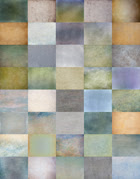
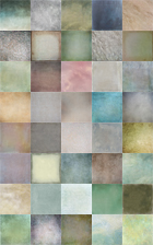
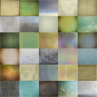
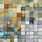
After the summers popular Spring Painterly set we now launch a third Painterly set, this time for Autumn, a misty, mellow sixth edition to flypaper Textures.
Our concept is Patrick Suskind's novel Perfume. This Sixth pack will also compliment Lensbaby's soft focus photography, the soft ethereal look particularly suits this new set! Flickr and Blog fans will have already seen our recent new texture images, and have kindly asked for the recipes, so, over the next few weeks we'll be putting up many recipes for its use, some mixed with the classic past textures which mix perfectly.
Our concept is Patrick Suskind's novel Perfume. This Sixth pack will also compliment Lensbaby's soft focus photography, the soft ethereal look particularly suits this new set! Flickr and Blog fans will have already seen our recent new texture images, and have kindly asked for the recipes, so, over the next few weeks we'll be putting up many recipes for its use, some mixed with the classic past textures which mix perfectly.
As our friends already know, here on this blog, we to try show how to add atmosphere to modern day imaging, showing in an innovative way, with a mouse-over action, the before and after effect of our textures.
We recommend Nik Software!!


We also have guest features on interesting photographic texture artists coming shortly.
Feel free to get in touch either by email or in the comments section here; we've also created a Flickr group for you to post your creations using our textures if you want.
Enjoy :-)
Paul and Jill
Click to find out more
Please note: Hover your mouse over the photos and you'll see a before-after effect.
Please find all our Getty images by clicking this button

We recommend Nik Software!!


We also have guest features on interesting photographic texture artists coming shortly.
Feel free to get in touch either by email or in the comments section here; we've also created a Flickr group for you to post your creations using our textures if you want.
Enjoy :-)
Paul and Jill
Click to find out more
Please note: Hover your mouse over the photos and you'll see a before-after effect.
Please find all our Getty images by clicking this button
Contact Us
Blog Archive
-
▼
2009
(90)
-
▼
November
(21)
- Five
- Bust and tree
- reflected light
- Faded Memories
- Flypaper Textures: Cow on the Hill
- The Happy Couple - Flypaper Textured :-)
- red box
- Night Surf
- derelict farmhouse
- Leave only Footprints...
- Life goes on
- Feeding Out
- Flypaper Textures video tutorials
- Three routes into mist
- Daisies
- A view from a Roman Bridge
- Mistaken Identity
- Martine Roch
- Voyageur map
- Quince Trio
- Clematis
-
▼
November
(21)
Links
Buy our Art
Photography and Blog Links
- Easy Recipes
- Self Sufficiency Dreams
- Digital Outback Photo
- The Girl Who Read to Birds
- One Woman, Reinvented
- LightWriter Images
- Keron Psillas
- Suess Fine Art Photography
- WoodSong Nature Photography/Artworks
- Tony Sweet's Visual Artistry Blog
- Justin Cline
- Tim Vollmer
- John Barclay Photography
- Dianna Alsept Photo Art
- Chronicles of a Country Girl
- CoffeeShop
- Colleen Farrell Fine Art Photography
- Corinne Geertsen
- Digiscrap101
- Digital Photography School
- Divas & Dreams
- Funky Photoshop Actions
- Jason Swain Photography
- Katie and Calli's Big Damn Blog
- Lani puppetmaker
- Lemontines 365
- Leslie Nicole Photography
- Light, Shoot & Edit
- Martine Roch
- MCP Actions Blog
- Nature & Photography by Philippe Sainte-Laudy
- On Linden Way
- Photo art by melinda
- Photography Homepages
Contributors
Followers
Stuck on Flypaper?
Copy this code and get your own Flypaper badge/button.
______________________
<a href="http://flypapertextures.blogspot.com/"><img alt="Flypaper Textures" src="https://blogger.googleusercontent.com/img/b/R29vZ2xl/AVvXsEjAZfJsf87AIpD7te9nnIw5LPY30BqD9lPlpKKpW5zUfbr8NN0H2p9TnLY8hYriNFhhSz51wZfTEU-HHFolU3auyVom94YKeVRy8_BbVI_j9-cI5SIREkJ1oy2Mc0XczNcfNDGW3nKQ2YMC//" /></a>
______________________

